METHOD & MUSE SPIRITS
“The branding should shout premium, but quirky.”
Operating out of Olde Town Arvada, Colorado, Method & Muse is a start-up distillery founded by a team with diverse scientific backgrounds, creative know-how, and broad palettes of world flavors that they bring to crafted selections of gins and amari.
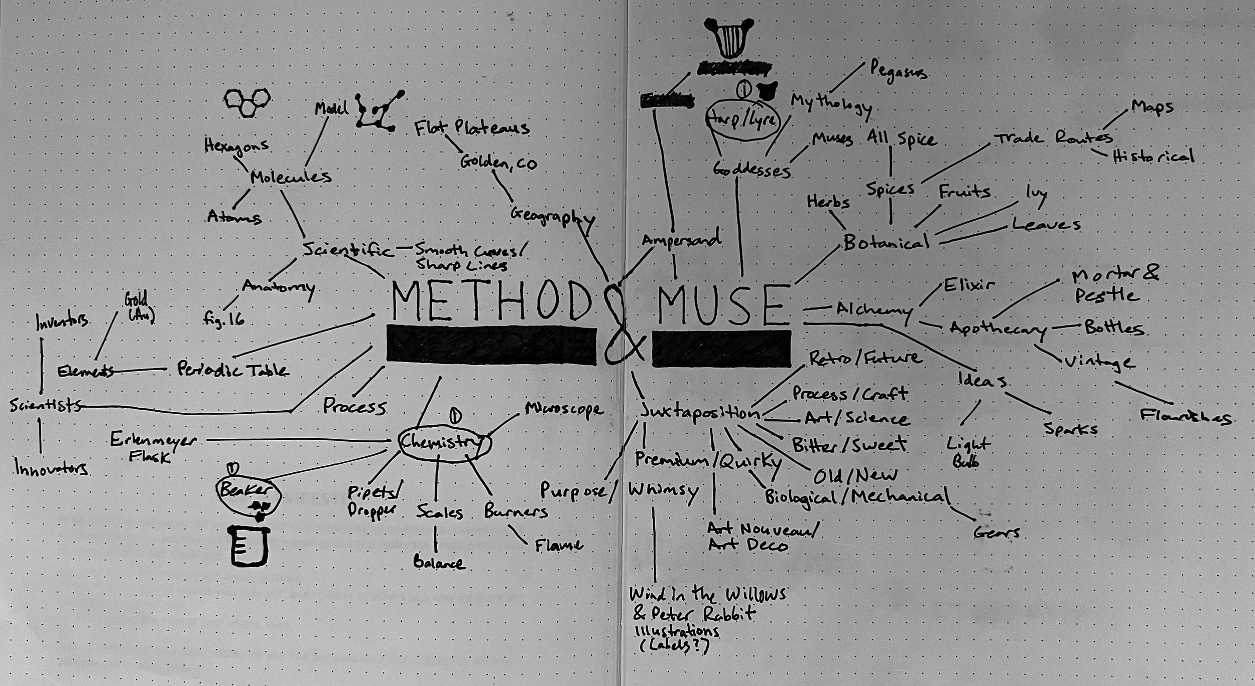
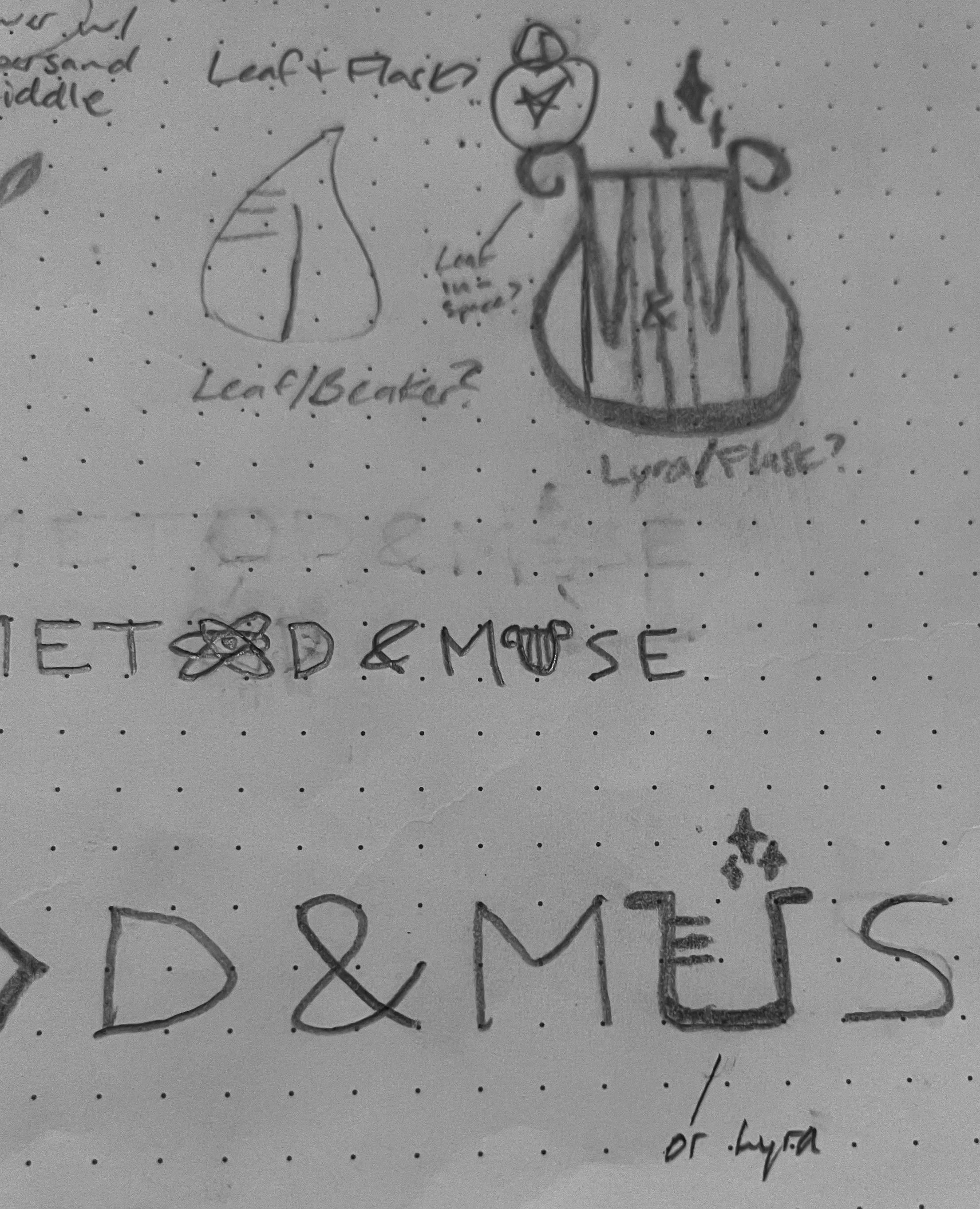
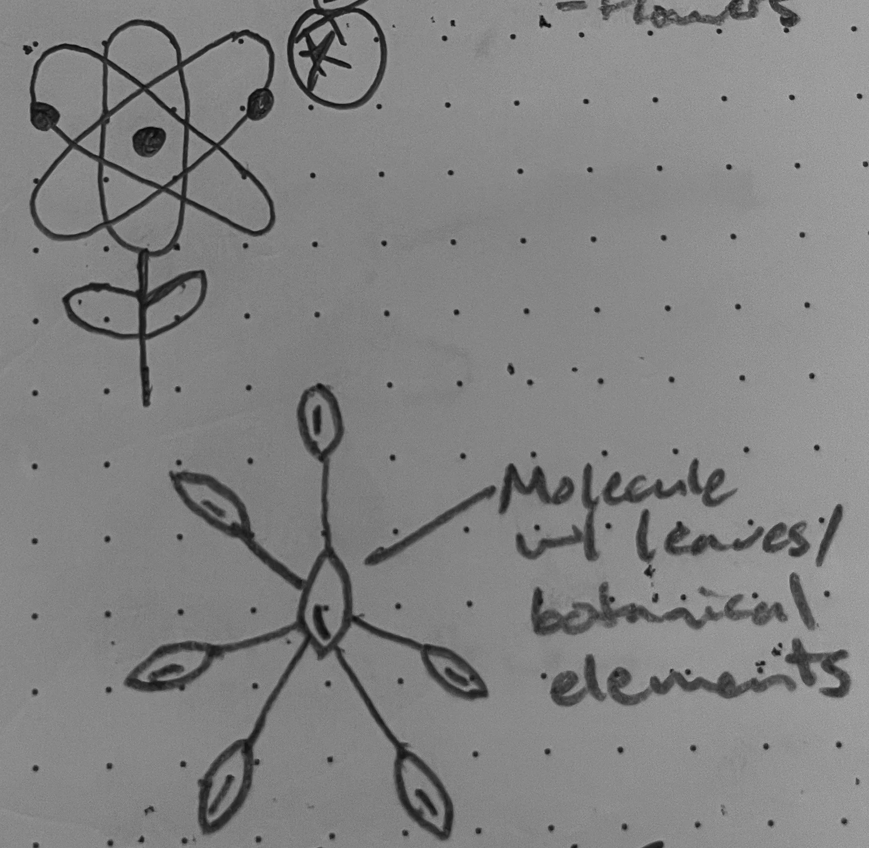
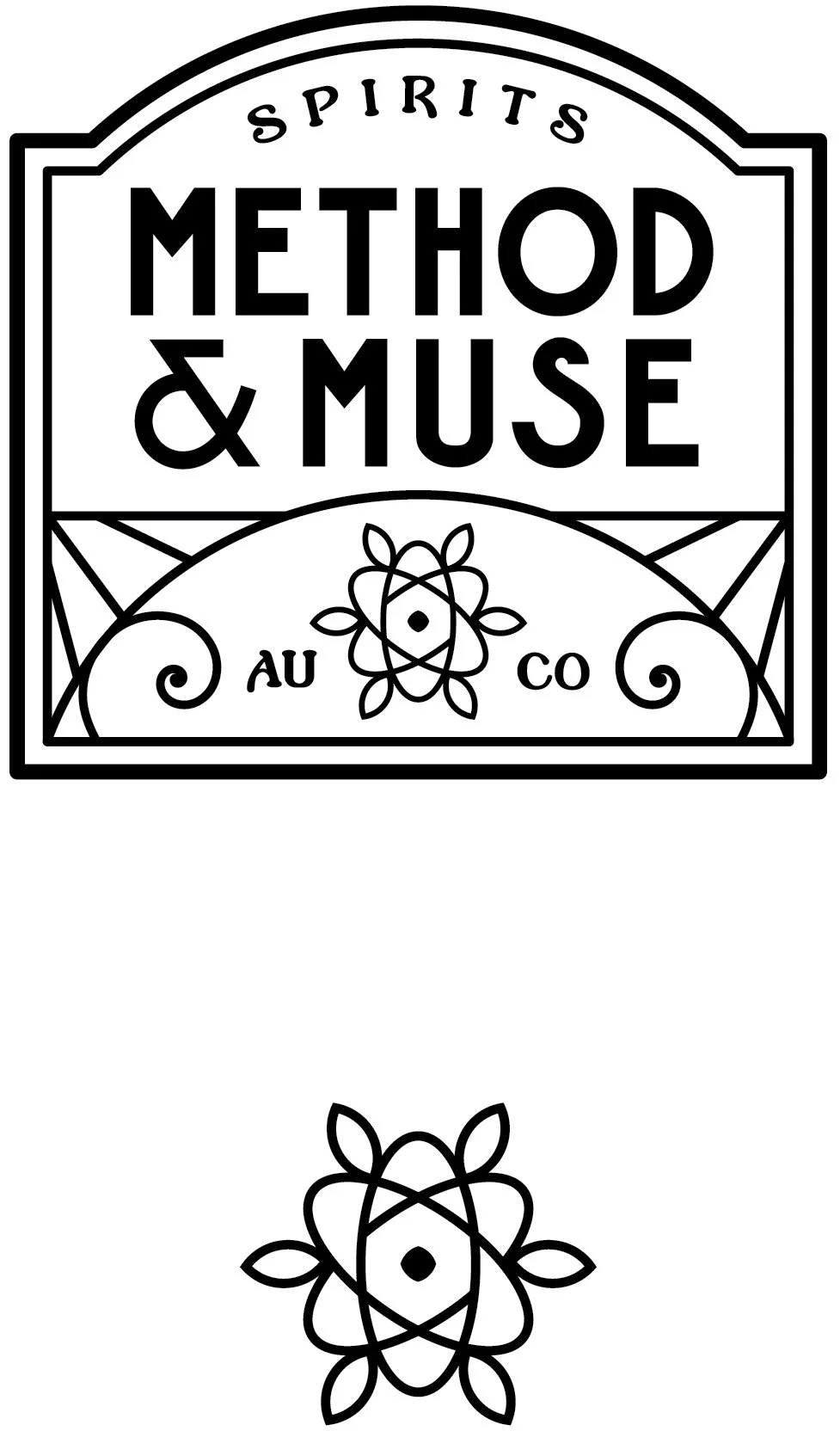
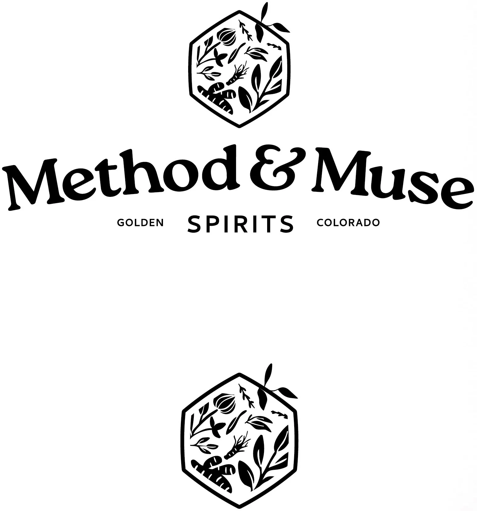
Their goal to create a brand started with the idea of juxtaposition, inspired by their philosophy of combining the science of distilling with artistic inspiration. The essence of the brand is to contrast ideas: process & craft, science & whimsy, premium & quirky. Through discovery and exploration with the client, we examined word cues and pairings that had potential to visually translate contrasting ideas: beaker & lyre, atom & flower, hexagon & botanicals.
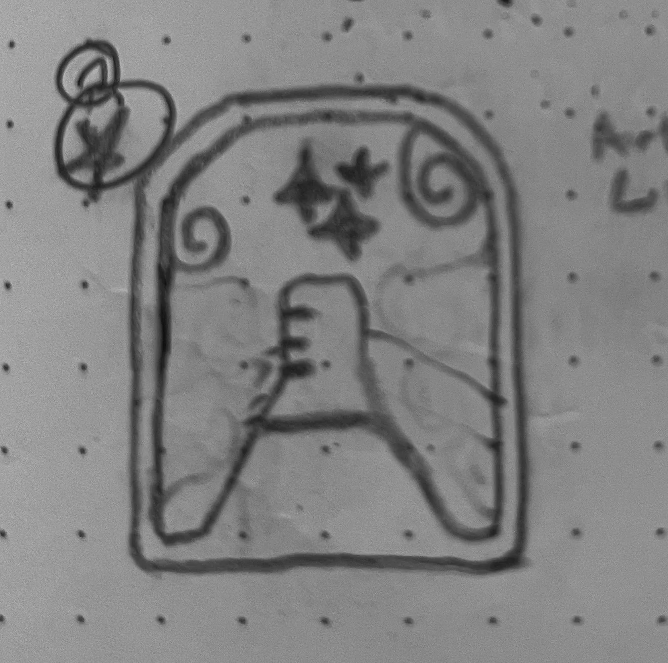
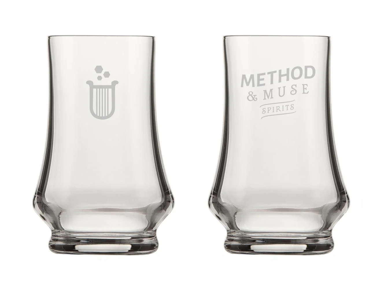
Various options were presented to the client with each option including a full-logo and mark-only variation. Is the logo appropriate for the business? Does the logo have utility to work in all sizes? Is the logo different from competitors so it can be easily remembered? After asking ourselves these questions, we decided to pursue the beaker & lyre concept.
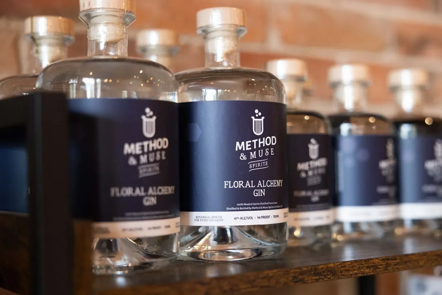
Once the logo was fine-tuned and finalized, we proceeded with bottle labels, business collateral, merch & apparel, and barware. The client was also provided with complete and comprehensive brand guidelines to ensure consistent messaging and communication as their brand continues to grow.
“Working with Michael was a treat! We definitely wouldn’t be in as good of a position in terms of brand identity without his help. We’re really looking forward to being able to work with Michael again and absolutely would recommend him to any organization that is looking to take their brand and story to the next level!”